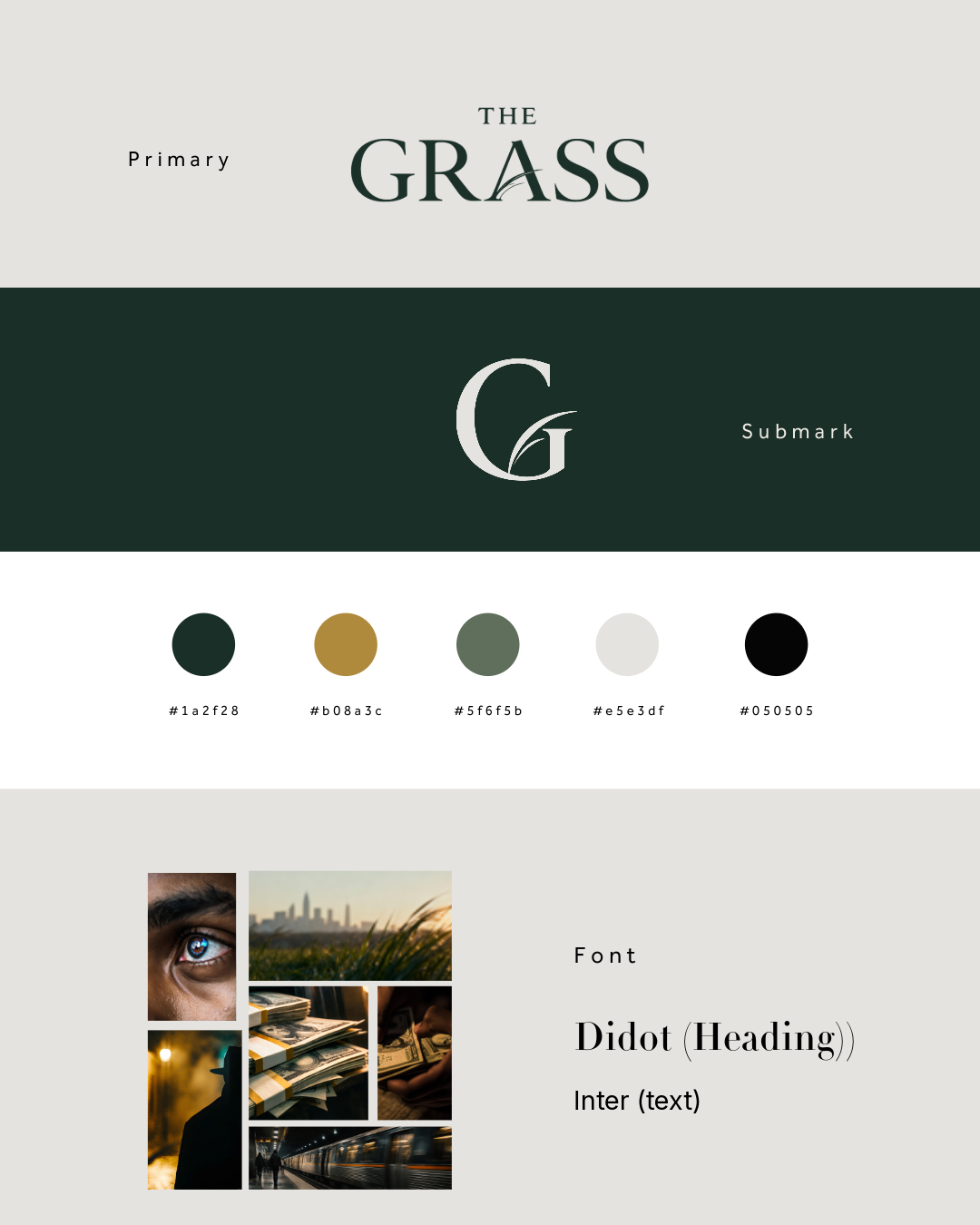
This branding guideline is a foundational visual identity. The project was created to establish a cohesive identity that supports storytelling across film intro visuals, typography, and motion design,
created for the entire direction, shaping how the story is visually expressed from concept to final execution. From the main logo to the secondary mark, each design decision was crafted to reflect themes of tension, suspense, mystery, and realism.The color palette was selected to evoke mood and atmosphere rather than distraction, balancing deep, grounded tones with muted highlights to reinforce a thriller gritty yet cinematic feel.
These colors are not only part of the static identity but are used throughout the intro—applied in overlays, transitions, and to subtly highlight key moments within shots. This creates visual continuity and strengthens the storytelling by guiding the viewer’s focus through emotion and tone.




These images were then refined and used as the foundation for AI-generated video sequences, ensuring consistency and cinematic cohesion throughout the intro.